
Best Ceiling Paint Color: 9 Shades by Room and Height
Updated: July 2026 · By Sophie Ulman
Best Ceiling Paint Color for Every Room
The best ceiling paint color isn’t a single shade — it’s whatever answers the specific problem your ceiling has. A low 7.5-foot ceiling needs a different answer than a soaring 12-foot great room. A north-facing bedroom that never sees direct sun needs a different answer than a sunny south-facing kitchen. Treat the ceiling as the room’s fifth wall, not an afterthought to paint over with whatever is left in the tray, and it becomes one of the cheapest ways to change how a room feels. Bear in mind that the swatch is not the finished colour — most paints shift as they cure, and whether paint dries darker or lighter explains which direction to expect.
I’ve painted ceilings in every shade on this list — some on my own house, some on client jobs — and the pattern holds every time: the right ceiling color makes a room feel intentional. The wrong one just makes the walls look like they’re fighting something overhead.
The first time I talked a client into a dark ceiling, I picked a color that looked moody and rich on the paint chip and turned into a cave the moment it went up in a room with one small window. We ended up repainting it two shades lighter within the month. Now I always test a full quart on the actual ceiling, viewed at the actual time of day the room gets used most, before committing to a gallon. A 2-by-2-foot swatch on a paint chip tells you almost nothing about how a color behaves overhead.
“Ceiling Paint” and Ceiling Colour Are Sold in Different Cans
This is the thing nobody tells you before you drive to the store, and it derails more ceiling projects than any colour choice on this page: a can labelled “ceiling paint” is almost always white and cannot be tinted to your colour. The three best-selling ceiling paints on Amazon right now — Zinsser 260967, Glidden Grab-N-Go and PRESTIGE — are all sold as a fixed white. Two of them go on pink and dry white on purpose, because the whole point of the product is showing you where the roller has been on a white-on-white ceiling. Tint one of those and you have thrown away the only feature you paid for.
So the moment you decide on any shade below other than white, you are no longer shopping for ceiling paint. You are shopping for a flat interior wall paint, bought in a tint base and mixed at the counter to your colour. That swap costs you three things worth knowing about up front:
- You lose the pink-goes-on, white-dries indicator. Not a real loss with a colour — a tinted flat shows its own wet edge fine.
- You lose the one-coat stain blocking that a dedicated ceiling paint carries. If your ceiling has water rings or a smoke halo, spot-prime them with a stain-blocking primer first, or they will ghost through your colour in a month.
- You may lose some anti-drip body. Ceiling paints are built thicker so they cling overhead. Wall flats are thinner. Load the roller half as much as you think and you will not wear the room.
None of that is a reason to skip a coloured ceiling. It is a reason to buy a quart of flat wall paint in your colour rather than a gallon of “ceiling paint” and expect the counter to tint it.
When White Is the Right Answer: 3 Ceiling Paints Worth Buying
Roughly two-thirds of the ceilings I paint end up white — because white is genuinely the right answer for small rooms, low ceilings and rentals. If that is you, these are the three I would actually buy, and I have flagged the manufacturer limits that the product pages bury.
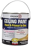
Zinsser Ceiling Paint & Primer in One (260967) — Best Overall White
This is the one I keep in the van. It goes on pink and dries bright white, which sounds like a gimmick until you are eight feet up on a ladder trying to see wet white paint against dry white paint under a work light — then it is the difference between a clean ceiling and a striped one. The mechanism is a fugitive tint that burns off as the water leaves the film, so the colour change is telling you the coat has actually dried, not just that time has passed.
It also blocks water stains in one coat, which matters because the most common reason anyone repaints a ceiling is a rust-coloured ring from an old leak. And unlike the Glidden below, Rust-Oleum lists the dried film as mildew resistant and names bathrooms and kitchens as intended rooms.
Honest limitation: Rust-Oleum’s stated spread rate is 250–400 sq ft per gallon, and that spread is not a rounding range — it is the difference between smooth drywall and texture. On a popcorn or knockdown ceiling plan on the 250 end and buy accordingly, because running short mid-ceiling means a visible lap line where the second gallon starts.
Best for: any white ceiling, and the only one of these three I would put in a bathroom or kitchen.
Check Price on Amazon →Via Amazon.com
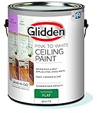
Glidden Grab-N-Go Pink to White Ceiling Paint — Best Budget White
Same pink-to-white trick as the Zinsser, usually a few dollars cheaper, and perfectly good on a plain bedroom or hallway ceiling that has nothing wrong with it. Flat finish, no primer step needed over sound previously painted drywall.
Honest limitation — and this one is the manufacturer’s own words, not mine: Glidden states this paint is not for use on bathroom ceilings. I have seen it recommended for bathrooms on more than one roundup and it should not be. Its coverage is also the weakest here: Glidden quotes 200–300 sq ft per gallon and that figure is measured on primed, smooth, non-porous surface, which is the best case, not the average one. Full cure is 30 days, so leave the ceiling alone before you scrub anything off it.
Best for: dry rooms — bedrooms, hallways, living rooms — on a smooth, sound, previously painted ceiling.
Check Price on Amazon →Via Amazon.com
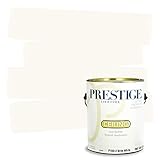
PRESTIGE Interior Ceiling Paint (Brite White) — Best for Acoustical Tile
A plain, no-indicator brite white, and the only one of the three whose manufacturer specifically names acoustical tile as an approved surface. That is a narrow spec but a genuinely useful one — drop-ceiling tiles in a basement or a home office are a surface most ceiling paints say nothing about, and the wrong product on mineral fibre tile either soaks straight in or seals the tile’s acoustic perforations shut.
Honest limitation: no colour-change indicator, so on a white-over-white job you are working blind — light the ceiling from the side rather than from below and you will see your wet edge. PRESTIGE also asks for a stain-blocking primer-sealer over stained or glossy surfaces rather than doing that work itself, and says to leave 14 days before cleaning it even gently.
Best for: drop-ceiling acoustical tile, basements and garages where the surface is unusual rather than the colour.
Check Price on Amazon →Via Amazon.com
9 Ceiling Colors and When to Use Them
1. Clean White
Still the most common answer, and for a practical reason: an untinted white ceiling recedes visually, drawing the eye to the walls and furniture instead. It hides minor drywall imperfections better than a color will and lets you change your wall color later without repainting overhead. A true, cool white works best paired with white or gray-undertone walls; if your walls lean warm, match the ceiling white’s undertone or it will look faintly gray by comparison.
Best for: small rooms, low ceilings, rentals, and anyone who wants to change wall colors again without redoing the ceiling.
2. Warm Cream and Soft Neutrals
A warm off-white or pale cream ceiling softens a room without the commitment of a full color. It reads as intentional rather than “unfinished,” and it’s forgiving of uneven lighting. This is the shade I reach for most often in bedrooms and living rooms where a stark white ceiling feels cold under warm lamp light in the evening.
Best for: bedrooms, living rooms, and any space lit mostly by warm-temperature bulbs.
Deep Dive
- 7 warm ceiling colors that make rooms feel instantly cozy — full shade list and product picks
3. Soft Blue and Blue-Green (Haint Blue)
A pale blue ceiling is a Southern porch tradition that has moved indoors — it reads as sky, adds a calm, airy feeling, and works especially well on covered porches, bathrooms, and bedrooms. The mechanism is genuinely psychological: pale, cool blues sit at the “receding” end of the color wheel, so the ceiling feels higher than it measures.
Best for: porches, bathrooms, bedrooms, and any room where you want the ceiling to feel taller than it is.
Deep Dive
- Best blue ceiling paint color: 7 calming shades — includes the haint-blue porch tradition and product picks
4. Deep, Moody Darks
A dark ceiling — charcoal, deep navy, forest green — works best in a room that already has generous natural light or a tall ceiling to spare. It creates a cocooning, intimate feeling that’s popular in dining rooms, media rooms, and primary bedrooms. Paint the ceiling a few shades darker than the walls rather than jumping to black; full black overhead reads as unfinished basement more often than “moody” unless the rest of the room is styled to match.
Best for: dining rooms, home theaters, and primary bedrooms with ceilings 9 feet or taller and strong ambient light.
5. Soft Sage and Botanical Green
Green ceilings borrow the calming association of the outdoors and work particularly well in home offices, reading nooks, and sunrooms. A muted, grayed-down sage reads as sophisticated rather than novelty; a bright grass green will fight almost every wall color you pair it with, so stay in the muted end of the green family for a ceiling application.
Best for: home offices, sunrooms, and reading nooks where you want a calm, focused feeling.
6. Neutral Greige and Soft Gray
If you like the idea of a non-white ceiling but aren’t ready to commit to a bold hue, a soft warm gray (a “greige”) is the lowest-risk entry point. It reads as intentional and finished without the visual weight of a true color, and it pairs with nearly any wall palette you choose next.
Best for: first-time colored-ceiling buyers, open-concept spaces, and transitional-style homes.
7. Two-Tone Ceilings
Coffered, beamed, or tray ceilings support a two-color treatment — a lighter shade in the recessed field, a darker or contrasting tone on the border or beams. This works because it follows the architecture instead of fighting it; on a flat, featureless ceiling, a two-tone treatment usually just looks like a mistake in the middle of the room.
Best for: coffered, beamed, and tray ceilings with real architectural detail to follow.
8. Lighter Ceiling, Darker Walls
Painting the ceiling a full shade or two lighter than the walls — rather than matching or going stark white — visually pushes the ceiling up and the walls out. The standard formula is roughly an 80/20 tint ratio (80% white to 20% of your wall color) mixed into the ceiling paint, which keeps it related to the wall color without competing with it.
Best for: low-ceiling rooms and narrow spaces where you want more perceived height without going fully white.
9. Same Color, Walls and Ceiling
Painting the walls and ceiling the exact same color removes the visual “stop” where wall meets ceiling entirely, making a small or oddly-shaped room feel like one continuous volume rather than a box with a lid. This works best in a light or mid-tone color; in a very dark color, the effect can feel enveloping in a good way in a small powder room, or oppressive in a large one — test before committing to the whole room.
Best for: small, awkward rooms (powder rooms, nooks, attic bedrooms) where you want to erase the boxy feeling.
⚠ When NOT to Color Your Ceiling
Skip a bold ceiling color if you’re renting and your lease requires a white ceiling at move-out — repainting a saturated color back to true white can take three or four coats of primer and paint, which is real time and money you won’t get back from a deposit. Skip it also on a heavily textured or popcorn ceiling that hasn’t been skim-coated first; texture reads as dust and shadow under any color darker than white, and it will look dirty rather than intentional no matter which shade you pick. And in a room with a ceiling under 8 feet and limited natural light, a dark or saturated color will make the room feel smaller and heavier, not cozier — that combination calls for the lighter-ceiling, darker-wall approach instead.
⚡ Pro Tips for Painting a Colored Ceiling
Prep matters more than the color you pick — durability and a clean line at the wall-ceiling joint come down to how well you cut in and how flat the surface is, not which shade is in the can. Always use a flat or matte finish on ceilings — sheen overhead exaggerates every roller mark and joint imperfection under angled light. Cut in the wall-ceiling line first with a brush, then roll the field while the cut-in edge is still wet to avoid lap marks. Two thin coats always beat one thick coat — this is true on ceilings even more than walls, since drips and heavy application show immediately overhead.
Ceiling Paint Coverage Calculator
🧮 How Many Gallons Do You Need?

The Number on the Back of the Chip That Decides Everything
Every paint chip carries a light reflectance value, printed small on the back or listed on the manufacturer’s site. It runs from 0 (absorbs all light) to 100 (reflects all of it). Ceiling white sits around 90 to 93. A mid grey sits near 45. That single number predicts how a ceiling will behave in a room better than the colour name ever will, because a ceiling has no direct light of its own — it lives entirely on light bounced up from the walls and floor.
The rule that has never failed me: keep the ceiling within about 10 points of the wall colour and one notch lighter, and the ceiling recedes. Drop it more than 25 points below the walls and the room reads as shorter, which is the effect you want in a tall bedroom and the effect that ruins a standard 8 foot living room. If a colour you love has an LRV under 30, use it in a room with two windows or accept that it will read almost black after dark.
Abstract numbers are hard to picture, so here is the ladder in real colours — one widely available shade for each of the families above, with the manufacturer’s published LRV next to it. Take your wall colour’s LRV, then read up or down this list to find where a ceiling can honestly sit.
| Shade family above | A real colour at that point | Published LRV | Ceiling height it suits |
|---|---|---|---|
| 1. Clean white | Benjamin Moore Chantilly Lace OC-65 | ~90 | Any — the safe default |
| 2. Warm cream / soft neutral | Sherwin-Williams Alabaster SW 7008 | 82 | Any, best under warm bulbs |
| 3. Soft blue-green (haint) | Sherwin-Williams Sea Salt SW 6204 | 63 | 8 ft and up |
| 3. Pale blue | Benjamin Moore Palladian Blue HC-144 | 62 | 8 ft and up |
| 6. Greige / soft grey | Sherwin-Williams Repose Gray SW 7015 | 58 | 8 ft and up |
| 5. Muted sage | Sherwin-Williams Evergreen Fog SW 9130 | 30 | 9 ft, two windows minimum |
| 4. Deep moody dark | Benjamin Moore Hale Navy HC-154 | 7 | 9 ft-plus with strong daylight |
Notice how fast the bottom of that list falls away. Between Sea Salt and Evergreen Fog you drop 33 points, and that is the whole difference between a ceiling that lifts a room and one that closes it in. Notice too that Alabaster and Chantilly Lace — two colours most people would both call “white” — sit eight points apart, which is exactly why a white ceiling over white walls can still look faintly dirty.
One caution on the numbers themselves: published LRVs are not as precise as they look. Chantilly Lace is quoted anywhere between about 87 and 92 depending on whose measurement you read, and the same spread applies to most pale colours. Treat LRV as a band of two or three points, not a decimal. It is still far more reliable than the colour name.
Where LRV lies to you: in a room with strong colour on the walls. A ceiling with LRV 80 above deep green walls picks up a green cast from bounced light and stops looking neutral, no matter what the chip says. In those rooms, test the ceiling colour on a board held flat overhead, not taped to the wall — a vertical sample gets direct light that a ceiling never sees, and it will look one shade lighter than the finished ceiling — the same drying-shift issue covered in do paints dry darker or lighter.
Ceiling colour is usually decided by the walls, not the other way round. If the room is heading somewhere saturated and moody, the ceiling has to answer it, and our shortlist of dark green paint colors shows which greens hold their depth under artificial light instead of going grey after dark. If the room is going warm and quiet instead, the ceiling generally wants to sit a shade lighter than the wall rather than jump to bright white — the range in our warm cream paint colour guide is the reference point for that.
Buying Guide: How to Choose the Right Ceiling Color
Start With Ceiling Height and Natural Light
These two factors decide more of your outcome than the color itself. A ceiling under 8 feet with a single small window is a poor candidate for anything darker than a soft neutral — you need the light-reflecting properties of pale colors to keep the room from feeling like a lid dropped on it. A tall ceiling with generous natural light can support nearly any color on this list, including full saturated darks.
Match the Undertone to Your Walls
The most common ceiling paint mistake isn’t picking the wrong color family — it’s picking a white or neutral with a mismatched undertone. A cool blue-white ceiling over warm cream walls will look dingy by comparison, even though both are technically “white.” Bring your wall color chip to the paint counter and match the undertone, not just the general shade name.
Sheen Always Stays Flat
Regardless of which color you choose, ceiling paint should be flat or matte. Any sheen overhead catches ambient light at an angle and highlights every roller mark, drywall seam, and minor imperfection that a flat finish would hide. This is one of the few absolute rules in ceiling painting — save the eggshell and satin finishes for walls and trim.
Test Before You Buy a Gallon
Paint a full quart onto a 2-by-3-foot section of the actual ceiling and view it at the time of day the room gets used most — morning light and evening lamp light can make the same color look like two different shades. According to This Old House’s guide to painting ceilings, testing under real lighting conditions is the single best way to avoid a costly repaint.
More From ThePaintly
- Best budget ceiling paint — solid coverage without the premium price
- Best one-coat ceiling paint — for fast turnarounds
- Garage ceiling paint guide — a different durability problem than living spaces
🎯 Verdict: What’s the Best Ceiling Paint Color?
For most rooms, a warm off-white or soft neutral is still the safest, most versatile starting point — it hides imperfections, pairs with almost any wall color, and won’t complicate a future repaint. If your ceiling is tall and well-lit, a moody dark or a soft color like haint blue is where the real transformation happens; those are the choices that make people notice the ceiling at all. Whatever you pick, stay in a flat or matte sheen, test a full quart under real lighting first, and remember that even Family Handyman’s own roundup of ceiling colors agrees on this: the paint matters less than the prep underneath it.
Frequently Asked Questions
What is the best ceiling paint color for a small room?
A clean white or very pale neutral is the safest choice, since lighter colors reflect more light and make the ceiling feel higher. If you want color, stay a shade or two lighter than the walls.
Should ceiling paint match the wall color?
It can — matching removes the visual break where wall meets ceiling, which helps small or awkward rooms feel like one space. For most rooms, a shade or two lighter than the walls looks more finished than an exact match.
Can I paint my ceiling a dark color?
Yes, but it works best with a 9-foot-plus ceiling and strong natural light. In a low, dim room, dark ceiling paint makes the space feel smaller and heavier rather than cozy.
What sheen should I use for ceiling paint?
Always flat or matte. Sheen on a ceiling catches angled light and highlights roller marks and seams that a flat finish would hide.
Do I need to prime before painting a colored ceiling?
Yes, especially when switching from white to a dark color or back. A tinted primer close to your final shade reduces topcoats needed and blocks old stains from showing through.
Does a colored ceiling make a room look smaller?
Only if the color is dark and the room lacks natural light. In a tall, well-lit room, a colored ceiling usually reads as intentional and finished rather than smaller.
Can ceiling paint be tinted to a color?
Usually not. Products sold as “ceiling paint” — Zinsser 260967, Glidden Grab-N-Go, PRESTIGE — are all supplied as a fixed white, and two of them dry from pink to white on purpose, so tinting destroys the feature. For a colored ceiling, buy a flat interior wall paint in a tint base and have it mixed to your shade.
What LRV should a ceiling be?
Within about 10 points of the wall color and one notch lighter, if you want the ceiling to recede. More than 25 points below the walls and the room reads shorter — useful in a tall bedroom, damaging in a standard 8-foot living room. Under LRV 30, expect the ceiling to read almost black after dark unless the room has two windows.