Best Blue Gray Paint Colors
Blue gray paint colors combine the calming vibe of blue with the sophistication of gray, offering a perfect balance for modern interiors. Whether you want a serene bedroom, a cozy living room, or a spa-like bathroom, these shades deliver timeless elegance. In this guide, we’ll explore the best blue gray paint colors from Sherwin Williams and Benjamin Moore, plus tips for using them effectively and product recommendations based on real reviews.
Why Blue Gray Paint Colors Are So Popular
Blue gray is loved by homeowners and designers because it works in almost any space. It’s versatile and complements both cool and warm tones in furniture and flooring. It creates a relaxing feel which is ideal for bedrooms, bathrooms, or any room where calmness matters. It’s also timeless, and unlike trendy colors, blue gray rarely goes out of style. Before you start painting, make sure the surface is clean to avoid streaks or uneven coverage. Here’s a helpful guide on how to clean walls before painting to get a smooth base.
Understand Undertones and Lighting First
Choosing the right shade means understanding how light affects color and how undertones can shift the mood.
Undertones to Watch
Blue grays can have subtle green, violet, or even brown undertones. For example, Benjamin Moore Boothbay Gray carries a hint of green, while Sherwin Williams Mineral Deposit leans slightly purple. These undertones will influence how your color feels in the room.
Lighting Makes a Difference
North-facing rooms make colors appear cooler and more gray, while south- or west-facing rooms bring out the blue warmth in these shades. If you’re painting ceilings as well, this guide on the best way to paint a ceiling can help you achieve crisp, clean transitions.
Best Sherwin Williams Blue Gray Paint Colors
Sherwin Williams has some standout blue paint with gray undertones that homeowners love.
Sherwin Williams Gray Screen (SW 7071)
Light, airy blue gray that is perfect for bedrooms and living rooms. It creates a clean backdrop for white trim and keeps spaces feeling open.
Sherwin Williams Rain (SW 6219)
A medium-depth blue gray that is ideal for accent walls or cozy dens. It adds personality without being overpowering and pairs beautifully with white trim.
Sherwin Williams Tradewind (SW 6218)
A soft, refreshing tone with subtle gray that’s perfect for coastal-inspired spaces. It pairs beautifully with warm wood accents and light floors.
Sherwin Williams Mineral Deposit (SW 7652)
A cool gray with purple undertones that’s great for offices, dining rooms, or dramatic hallways. It adds depth and sophistication without making rooms feel too dark.
Best Benjamin Moore Blue Gray Colors
Benjamin Moore blue gray colors offer depth and richness with timeless appeal. Here are the top favorites.
Benjamin Moore Stonington Gray (HC-170)
A subtle gray with blue undertones that is extremely versatile for any space. It works beautifully with crisp white ceilings.
Benjamin Moore Gray Cashmere (2138-60)
A soft blue gray with green undertones that feels calming and spa-like, ideal for bedrooms and bathrooms.
Benjamin Moore Boothbay Gray (HC-165)
A mid-tone blue gray leaning slightly green that is a classic choice for kitchen cabinets, trim, or built-ins.
Benjamin Moore Nimbus Gray (2131-50)
A deeper gray with rich blue undertones that is excellent for accent walls or moody spaces. When planning your project, it’s useful to know how long it takes to paint a room so you can allocate enough time for each coat.
Popular Light Blue Paint Colors with Gray Undertones
If you want brightness without looking like a nursery, these popular light blue paint colors with gray undertones are ideal.
Sherwin Williams First Star
A cool-toned, very pale blue gray that works well in small or dark rooms and reflects light beautifully.
Benjamin Moore Silver Gray
An airy and elegant shade that adds subtle color without overwhelming the space and keeps rooms feeling fresh.
Sherwin Williams Lullaby
A whisper-soft blue with gray undertones that feels calming and clean, perfect for bathrooms or nurseries. These work especially well if you pair them with a neutral ceiling. Here’s a list of the best ceiling paint colors that can complement blue gray walls.
How to Use Blue Grey Interior Paint in Your Home
Using blue grey interior paint is all about placement and balance.
Accent Walls
Choose darker tones like Nimbus Gray or Mineral Deposit. These add depth and drama behind a bed, fireplace, or bookcase.
Entire Rooms
Go with lighter colors like First Star or Silver Gray. They make rooms feel airy and open while keeping a clean look.
Small or Low-Light Rooms
Avoid dark blue grays, which can feel heavy. Lighter warm-leaning shades will keep the space feeling fresh. If you plan to paint the ceiling in the same project, see this list of best white ceiling paint to ensure your trim and ceiling don’t clash with your wall color.
Common Mistakes to Avoid
Skipping large samples is the most common mistake. Always test on at least a 2×2 ft area. Don’t ignore trim color—white trim makes blue stand out while cream softens it. Avoid choosing the wrong finish because glossy paint can exaggerate undertones and wall flaws. Also read about the benefits of painting your home if you’re debating a full repaint.
Recommended Blue Gray Paint Products
Here are a few best grayish blue paint colors you can try through sample pots or budget-friendly alternatives.
Oslo Home Touch-Up Paint (Comparable to Sherwin Williams Agreeable Gray)
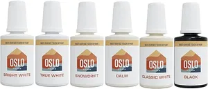
Pros: Low odor, quick-drying, perfect for testing small areas
Cons: Small 20ml size, not suitable for large walls, slight tone variation possible
Prestige Paints Interior Paint & Primer (Comparable to Sherwin Williams Agreeable Gray)
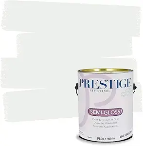
Pros: Built-in primer, good coverage, easy cleanup
Cons: Semi-gloss finish may highlight wall imperfections, undertone may vary slightly from original
Before you start rolling, make sure you have quality tools. This list of best paint roller covers can help you get a smooth, streak-free finish.
Styling Tips for Bluish Gray Interior Paint
Use white ceilings to enhance contrast and make the room feel taller. Add warmth using warm wood furniture, brass fixtures, or cream textiles to balance cool tones. Control lighting carefully, warm LED lights (2700–3000K) make blue grays feel cozy, while daylight bulbs make them cooler. Pick the right sheen: matte hides flaws, eggshell adds soft glow, and satin is durable yet subtle. If you want your paint job to dry faster, here’s how to make paint dry fast so you can enjoy your room sooner.
Final Thoughts
Blue gray paint colors offer an unbeatable blend of calm and sophistication. If you want a safe yet stylish choice, try Benjamin Moore Stonington Gray or Sherwin Williams First Star. They are subtle enough for whole rooms but still give that signature blue gray character. If you prefer something moodier, Benjamin Moore Nimbus Gray or Sherwin Williams Mineral Deposit create beautiful depth on accent walls. Whatever you choose, always test samples in your own light before committing.
How to Stop a Blue Gray Reading as Baby Blue on the Wall
This is the failure mode of the entire colour family. A blue gray looks sophisticated and slate-like on the chip, goes on the wall, and by the second coat the room has turned into a nursery. It happens for a reason you can predict and avoid.
Blue gray is a gray carrying a blue bias, and the size of the painted area decides how much of that bias you see. A two-inch chip shows you the gray. Four walls show you the blue, because colour intensifies with area – the eye reads the accumulated hue rather than the muted sample. Any blue gray will look bluer at scale than it did in your hand. Choosing a shade that already reads distinctly blue on the chip guarantees it will read as pure blue on the wall.
Light then multiplies the effect. Cool north-facing light adds blue to everything it touches, so a blue gray in a north room shifts further toward blue and can lose its grey entirely. The same colour in a warm, south-facing room stays much closer to what you picked, because the warm light counteracts the bias. This is why a shade that looks perfect in a friend’s living room can look completely different in yours.
The practical fix is to choose down. Pick a blue gray that looks almost too grey on the chip – one where you have to look for the blue rather than see it immediately – because the wall will supply the blue you think is missing. Checking the paint’s listed LRV also helps: a lower LRV shade holds its depth and its grey character better at scale, while very light blue grays wash out into pastel most easily.
The other lever is what surrounds it. Blue gray next to a crisp white trim reads cooler and bluer; the same colour against a warm white or a cream reads greyer and more grounded. Warm wood floors and brass fittings pull it back toward slate. If you have picked a colour you like and are worried about it going pastel, changing the trim white is often a bigger correction than changing the wall colour.
When Blue Gray Is the Wrong Choice for the Room
Blue gray is versatile but it is not universal, and there are rooms where it works against you.
- North-facing rooms with little natural light. Cool light plus a cool colour reads cold and can make the room feel unwelcoming. A warm-leaning greige holds up far better there.
- Rooms with strong warm wood or orange-toned floors. Cool blue directly against warm orange is a hard contrast that makes both look worse. Test against the actual floor before committing.
- Very small rooms in a light shade. A pale blue gray at scale in a small room usually lands on pastel, which is not the effect most people are after.
- Under warm-temperature bulbs. Warm artificial light neutralises the blue and can leave the colour looking flat and muddy after dark, which is when you are most often in the room.
- As a whole-house neutral. Blue gray has enough character that it competes with furniture and art across an open plan. It works better as a room colour than as the backdrop for everything.
Frequently Asked Questions
Why does blue gray paint look more blue on the wall?
Because colour intensifies with area. A small chip mutes the blue bias; four walls accumulate it, and the eye reads the hue rather than the grey. Any blue gray will appear bluer at full scale than it did on the sample.
How do you pick a blue gray that stays grey?
Choose one that looks almost too grey on the chip – where you have to search for the blue rather than see it at once. The wall will supply the blue. A lower LRV also helps the shade hold its depth instead of washing out.
Does blue gray work in a north-facing room?
It is the hardest room for it. North light is cool and adds blue, so a cool colour there can lose its grey character and read cold. If you want blue gray in a north room, pick the warmest, greyest version you can find.
What trim colour goes with blue gray walls?
A warm white or soft cream keeps the walls reading grey and grounded. A crisp, cool white pushes them bluer by contrast. Changing the trim white is often a more effective correction than changing the wall colour.
What is LRV and why does it matter for blue gray?
Light Reflectance Value describes how much light a colour reflects, on a scale from black to white. Lower LRV blue grays keep their depth and slate character at full scale, while high-LRV ones lighten and drift toward pastel on a wall.
How should you sample a blue gray before painting?
Two coats on a large white card, then move it around the room across a full day and hold it against the floor, the trim and the furniture that are staying. Painting a patch straight onto a coloured wall distorts what you see.