Paint Colors That Make Your Home Look Dirty
When you walk into a freshly painted home, the first thing you notice is how clean and bright it feels. But here’s the catch: not all paint colors create that effect. Some shades actually have the opposite impact, they can make your home feel older, dingier, or even grimy, even if it’s spotless. Knowing the paint colours that make your home look dirty is crucial before you pick up a brush or roller.
In this guide, we’ll break down the dirty looking paint colors, explain why they backfire, and share smarter alternatives so your home always feels fresh, inviting, and well-kept.
Why Certain Paint Colors Look Dirty Over Time
Paint color isn’t just about style, it’s also about maintenance. Some hues naturally highlight dust, fingerprints, or shadows. Others fade poorly, leaving uneven patches that resemble stains.
Before diving into the dirty paint colors examples, let’s explore the common reasons why your walls might not age gracefully:
- Low Light Reflection: Dark or muddy tones trap light and create a dull, dingy feel.
- Easily Marked Shades: Pale colors like beige or off-white show dirt, scuffs, and smudges quickly.
- Undertones Gone Wrong: Gray with green undertones or beige with yellow tones can look “muddy” instead of warm.
- Moisture & Stains: Poor paint quality leads to marks sticking permanently, especially in kitchens and bathrooms.
For these high-moisture areas, you should always invest in the best ceiling paint for bathrooms or kitchens to keep surfaces clean and mold-free.
Paint Colors That Make Your House Look Dirty
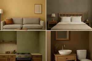
Here are the main offenders that instantly downgrade your home’s appearance:
1. Dull Beige and Yellow-Toned Neutrals
While beige was once popular, many outdated shades now give off a dirty or “smoker’s house” vibe. Yellower undertones fade unevenly and make walls appear stained.
- Alternative: Opt for soft greige (gray + beige) tones that balance warmth and freshness.
- Quick Tip: Before painting, always prep properly with wall cleaning techniques to avoid dirt clinging to old paint layers.
Quick Tip
Before painting, always prep properly with wall cleaning techniques to avoid dirt clinging to old paint layers.
2. Flat Gray with Green or Brown Undertones
Certain grays can look modern, but when undertones skew too earthy, they end up looking muddy. These are among the most common dirty paint colors for walls.
- Alternative: Choose a light, airy gray with blue or cool undertones to create brightness instead of heaviness.
- Resource: If painting ceilings, check out the best ceiling paint color guide to keep your spaces balanced.
3. Off-White or Cream Shades
You might think white is safe, but the wrong undertone can betray you. Off-white with too much yellow or brown looks like it has years of built-up grime.
- Alternative: Crisp whites or cooler-toned neutrals are the best paint colors for house interiors where brightness matters.
- Related: To refresh an older ceiling, consider high-hiding ceiling paint to cover stains effectively.
4. Olive Green and Mustard Yellow
These retro colors can be cozy in theory, but in practice they make rooms appear dated and unclean. They’re classic examples of dirty looking paint colors because they absorb light poorly.
- Alternative: If you love earthy colors, swap olive for sage green or mustard for a soft sunflower yellow.
Pro Tip
Use washable ceiling paint if pairing these shades with lighter ceilings.
5. Dark Browns and Muddy Reds
Dark chocolate or rusty reds might feel dramatic, but in low light they look like dirt smudges across your walls.
- Alternative: Warm taupe or terracotta provides earthiness without grime.
- Useful Guide: See benefits of painting your home to learn how smart color choices impact mood and cleanliness.
Best Paint Colors for Dirty Homes
Now that we’ve covered the worst offenders, let’s look at the best paint colors for dirty homes, shades that resist marks, hide imperfections, and make spaces look polished.
- Light Greige: Timeless, hides dirt, and works in every room.
- Soft Blue-Grey: Adds brightness and freshness.
- Taupe: Warmer than gray, cooler than beige, great balance.
- True White: Only when paired with durable, washable paint formulas.
For high-traffic areas, pairing these shades with the best drywall primer ensures longer-lasting results.
Best Paint for Dirty House Surfaces
Walls aren’t the only place where dirt builds up. Kitchens, bathrooms, and basements are notorious for marks, stains, and moisture damage. To fight back, choose:
- Washable Formulas: Satin or semi-gloss finishes for easy cleaning.
- Mold-Resistant Paints: Perfect for bathrooms and kitchens. (See best paint for steamy bathroom ceilings).
- Durable Ceiling Paints: High-moisture resistant formulas for long-lasting protection.
These options aren’t just the best dirty paint colors, they’re the best paint types for homes that face everyday wear and tear.
Dirty Paint Colors Examples to Avoid
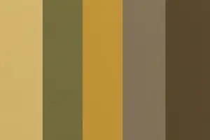
Let’s recap with some specific dirty paint colors examples you’ll want to skip:
- Beige with yellow or orange undertones
- Olive green
- Mustard yellow
- Muddy gray with green or brown undertones
- Dark brown or rusty red
- Creamy off-whites with yellow tint
How to Avoid Dirty-Looking Walls
Beyond picking the right shades, here are key steps to keep your home looking fresh:
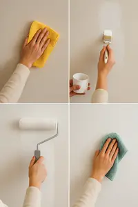
- Prep the Walls: Clean thoroughly before painting, see how to clean walls before painting.
- Prime Properly: Use a high-quality primer like best drywall primer for smooth coverage.
- Right Tools: Invest in good brushes and rollers, see best paint edging tool for precision.
- Ceiling Choice: Match your wall color with the best ceiling paint for consistency.
- Maintenance: Wipe walls regularly with a damp cloth to prevent buildup.
Final Thoughts: Choose Clean, Not Dirty
Paint can transform your home, but the wrong shades make even spotless rooms feel grimy. By avoiding paint colors that make your house look dirty and embracing fresh, modern alternatives, you ensure your home always looks clean, welcoming, and stylish.
Next time you’re planning a paint project, remember: choose tones that reflect light, hide imperfections, and complement your lifestyle. With the right approach, plus smart prep like how long it takes to paint a room, your walls will stay beautiful for years.
Why a Colour That Looked Clean in the Store Looks Dirty on Your Wall
It is almost never the colour. It is the undertone, and the light in your room revealing an undertone the shop lighting hid.
Every neutral has a bias underneath it. A beige leans yellow, pink or green. A gray leans blue, purple or green. On a two-inch chip under bright retail lighting that bias is invisible, because there is not enough of the colour on show and the light is engineered to flatter. Put the same paint across a whole wall in a room lit from one side and the undertone amplifies. A gray with a green bias in a north-facing room stops reading as gray and starts reading as the colour of dishwater, and no amount of cleaning fixes it, because nothing is dirty.
Light direction does most of the work here. North-facing rooms get cool, indirect light that pushes every colour greyer and pulls out green and blue undertones. South-facing rooms get warm light that pushes colours yellow, which is what turns a soft cream into something closer to nicotine. West-facing rooms shift through the day, looking flat in the morning and orange by evening. The same tin of paint produces four different results in four rooms of one house.
The other half of the problem is what is already in the room. Warm oak floors throw reflected yellow up onto the walls. A large lawn or a tree outside a window throws green in. A red brick patio throws warmth. Paint does not exist in isolation – it sits in a room full of surfaces bouncing colour onto it, and a neutral that fights those reflections is the one that reads as grubby.
The test that solves it costs almost nothing and I now refuse to skip it. Paint two coats onto a large piece of white card – not directly onto the wall, where the existing colour distorts it – and move that card around the room across a full day. Look at it in the morning, at midday, in the evening under the lamps you actually use, and against the floor and the furniture that are staying. A colour that holds up through all of that will not surprise you later. I skipped this once on a hallway and lived with a wall the colour of weak tea for two years.
When the Problem Is Not the Colour at All
Before repainting, rule these out – each one produces the same dingy result and none of them is solved by a new colour.
- Sheen that is too flat for the room. Flat paint absorbs light and holds dirt in high-traffic areas. In a hallway or a kitchen, a low sheen that can be wiped often fixes the look on its own.
- Bulb colour temperature. Warm bulbs push every neutral yellow; very cool bulbs make warm neutrals look muddy. Changing bulbs is cheaper than repainting and sometimes it is the whole answer.
- Genuine film build-up. Kitchens and rooms that were once smoked in carry a translucent layer that dulls everything. Wash a test patch with sugar soap – if it comes up noticeably brighter, the wall is dirty rather than the colour wrong.
- An old coat that has yellowed. Oil-based paints yellow with age, especially in low light. That is the paint aging, not the shade you chose.
- Reflected colour from outside. Heavy foliage or a coloured fence right outside a window tints the whole room. Nothing on the wall will beat it; a window treatment will.
Frequently Asked Questions
What paint colours make a room look dirty?
Neutrals with a strong green or muddy-yellow undertone are the usual culprits, along with mid-tone greiges in poor light. It is rarely the colour family itself – it is the undertone being amplified by the light direction and by colour reflected off floors and furniture.
Why does my gray paint look green or purple on the wall?
Because every gray carries an undertone, and a large area in real room light reveals it. Cool north light pulls out green and blue biases; warm light pulls out purple and pink ones. The chip in the shop was too small and too well lit to show it.
How do you test a paint colour properly before committing?
Paint two coats onto a large white card rather than onto the wall, then move it around the room over a full day – morning, midday and evening under your own lamps – and hold it against the floor and furniture that are staying. Painting directly on the wall lets the existing colour distort what you see.
Does north-facing light change how paint looks?
Considerably. North light is cool and indirect, so it greys colours down and emphasises green and blue undertones. Warm-leaning neutrals generally hold up better in north-facing rooms than cool ones.
Is it the paint or is my wall actually dirty?
Wash a small test patch with sugar soap and compare. If the patch comes up clearly brighter, you have film build-up rather than a colour problem, which is common in kitchens and in rooms that were smoked in.
Does flat paint make a room look dingier than eggshell?
It can. Flat finishes absorb light rather than reflecting it and hold onto marks in high-traffic areas. In hallways, kitchens and children’s rooms a slightly higher sheen usually reads cleaner and can be wiped.
About the author: Sophie Ulman has renovated and painted more rooms than she can count — and made every mistake in the book so you don’t have to. She focuses on real-world durability: not how products perform on day one, but whether the repair holds through a full seasonal cycle.